pacman::p_load(ggrepel, patchwork,
ggthemes, hrbrthemes, tidyverse)Hands_On_Exercise 02
Installing Packages
Importing Data
exam_data <- read.csv('data/exam_data.csv')Beyond ggplot2 Annotation: ggrepel
ggplot(data=exam_data,
       aes(x=MATHS, y=ENGLISH)) +
  geom_point() + geom_smooth(method=lm, size=0.5) +
  geom_label(aes(label=ID), hjust=.5, vjust=-.5) +
  coord_cartesian(xlim=c(0,100),ylim=c(0,100))+
  ggtitle('Eng Score vs Maths Score')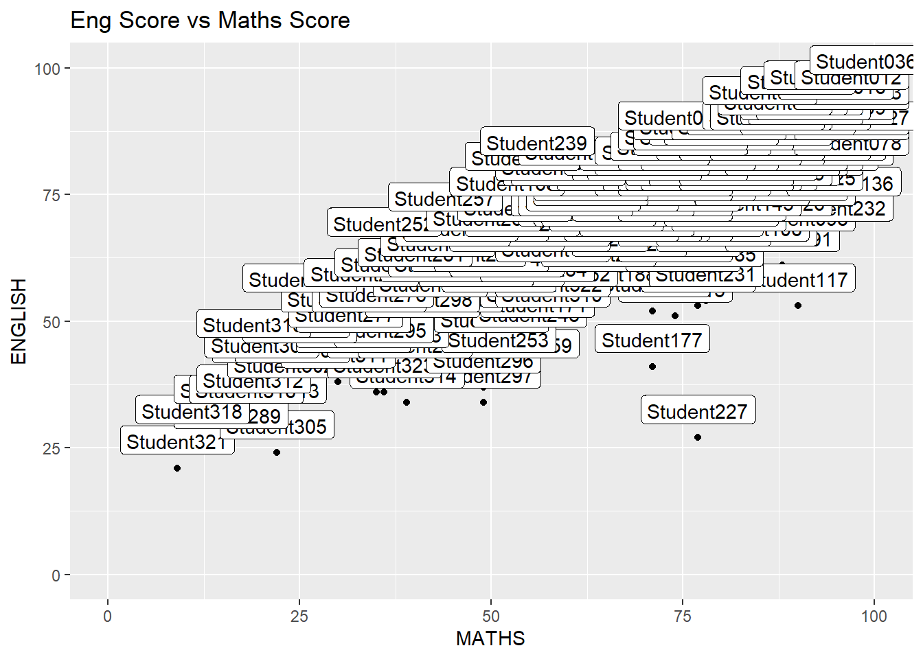
Using ggrepel to modify the graph above
ggplot(data=exam_data,aes(x=MATHS,y=ENGLISH))+geom_point()+geom_smooth(method=lm,size=0.5)+geom_label_repel(aes(label=ID),fontface='bold')+coord_cartesian(xlim=c(0,100),ylim=c(0,100))+ggtitle('Eng Score vs Maths Score')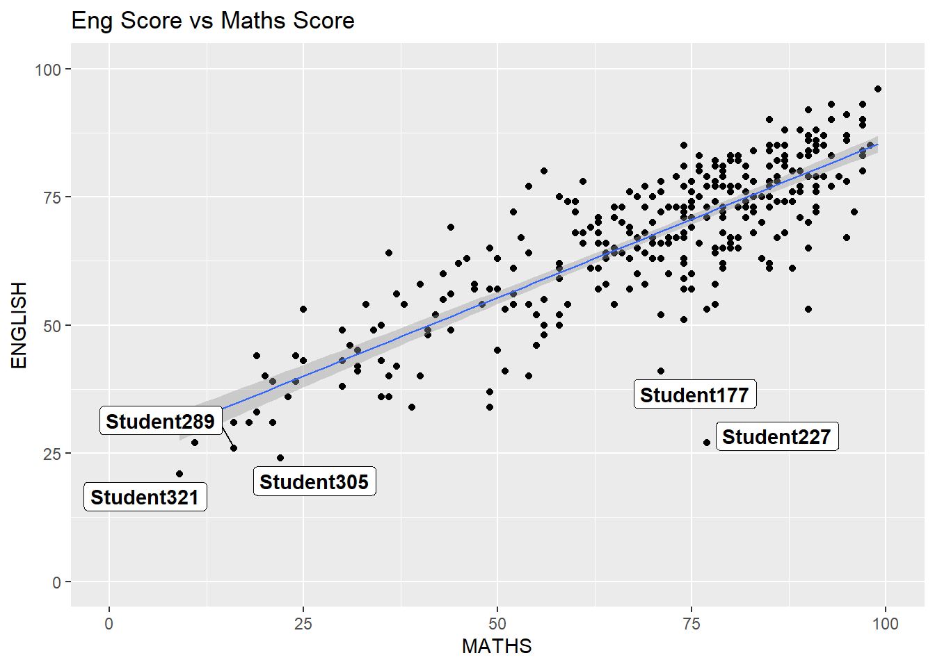
ggplot2 themes
ggplot(data=exam_data, aes(x=MATHS))+ geom_histogram(bins=20,boundary=100,color='grey25',fill='grey90')+theme_minimal()+ggtitle('Distribution of Maths Score')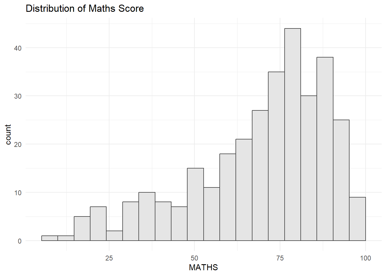
Working with hrbthems package
ggplot(data=exam_data, aes(x=MATHS)) + geom_histogram(bins=20,boundary=100,color="grey25", fill="grey90")+ggtitle('Distribution of Math')+theme_ipsum_es(axis_title_size = 18, base_size = 15, grid = "Y")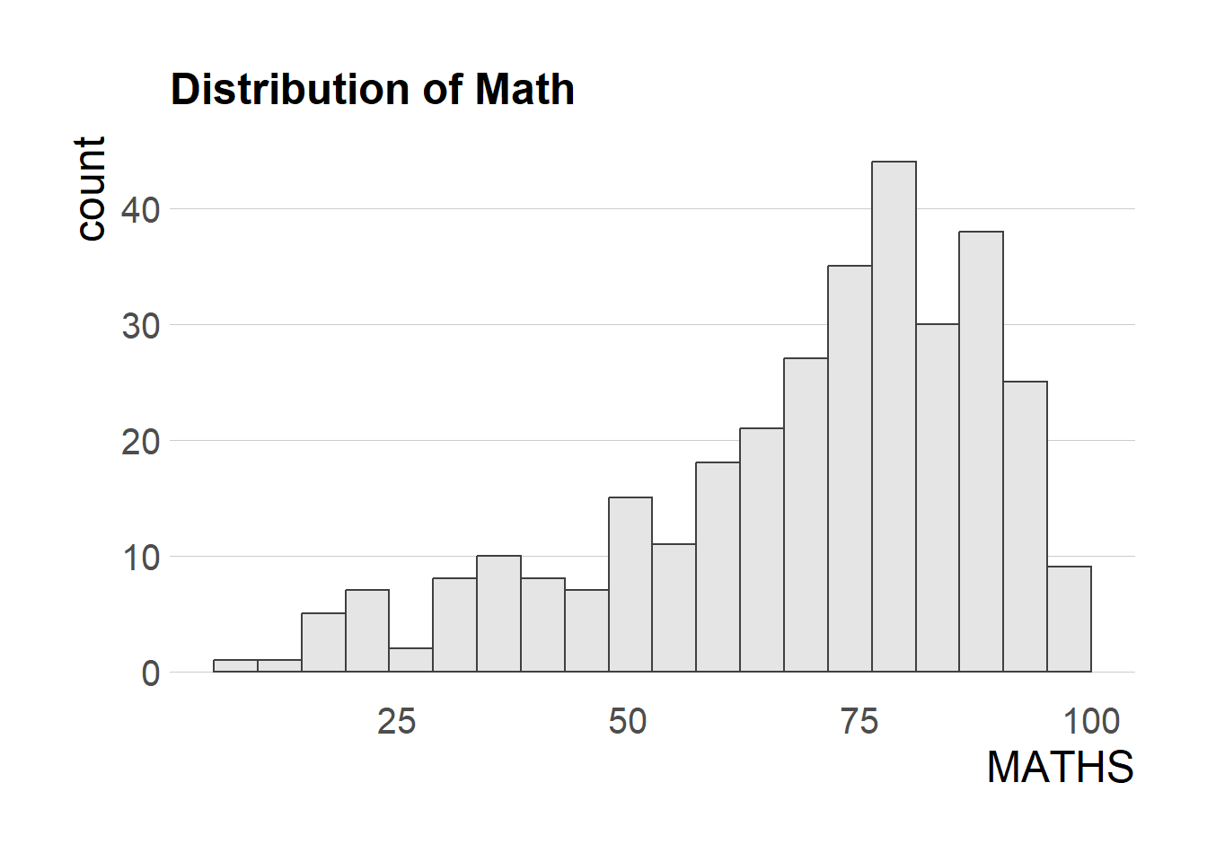
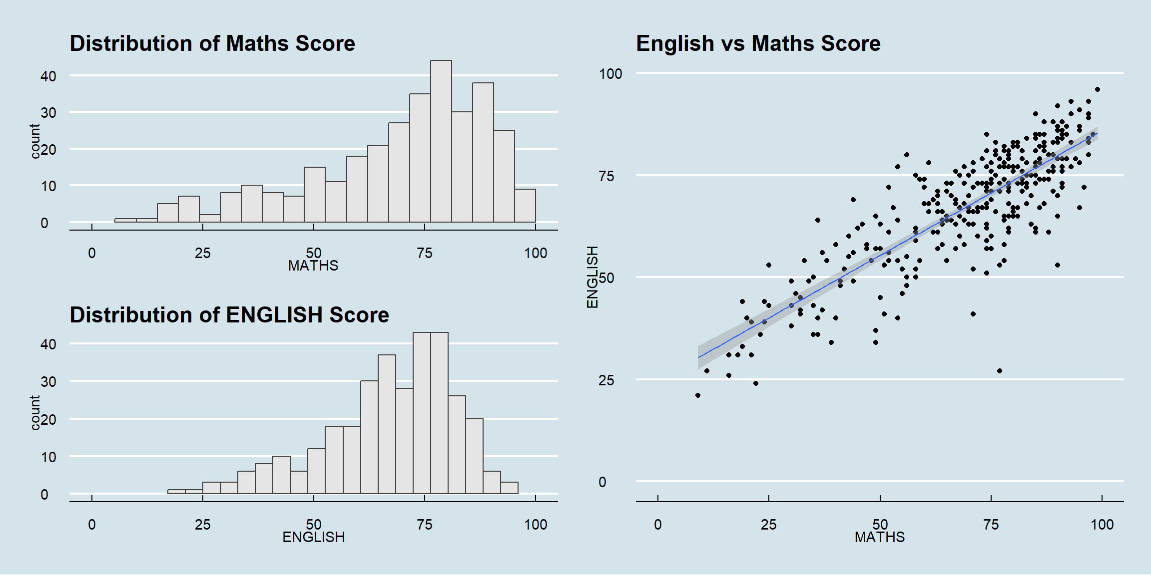
Creating Multiple Graphs
p1 <- ggplot(data=exam_data, aes(x=MATHS)) + geom_histogram(bins=20, boundary=100, color='grey25',fill='grey90')+coord_cartesian(xlim=c(0,100)) + ggtitle('Distribution of Maths Score')p2 <- ggplot(data=exam_data, aes(x=ENGLISH)) + geom_histogram(bins=20, boundary=100, color='grey25',fill='grey90')+coord_cartesian(xlim=c(0,100)) + ggtitle('Distribution of ENGLISH Score')p3 <- ggplot(data=exam_data, aes(x=MATHS, y=ENGLISH))+ geom_point()+ geom_smooth(method=lm,linewidth=0.5)+coord_cartesian(xlim=c(0,100),ylim=c(0,100))+ggtitle('English vs Maths Score')Combining Graphs
p1+p2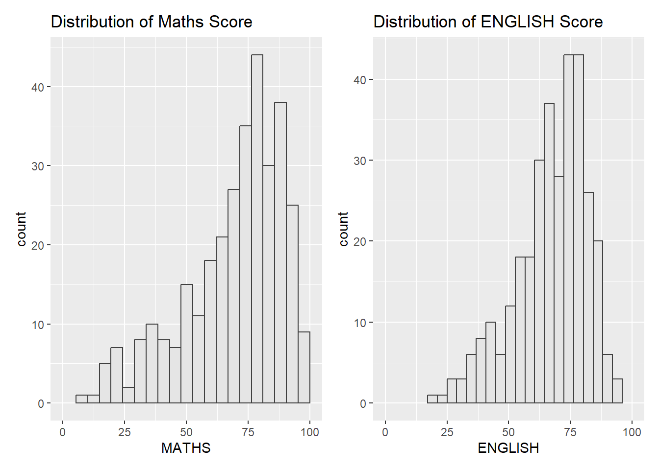
(p1/p2)|p3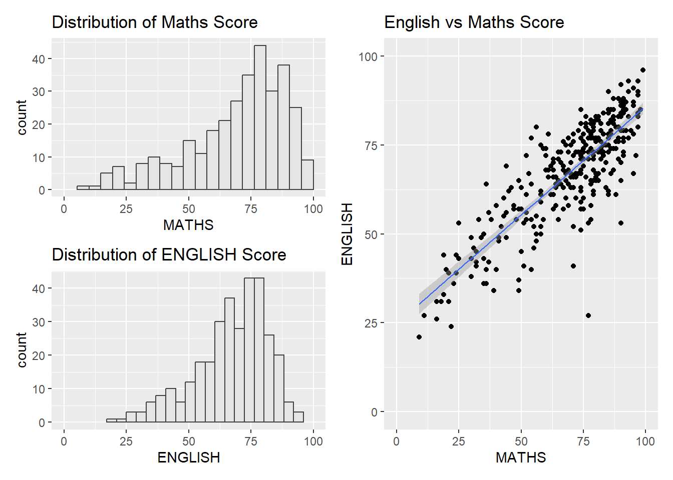
((p1 / p2) | p3) +
  plot_annotation(tag_levels = 'I')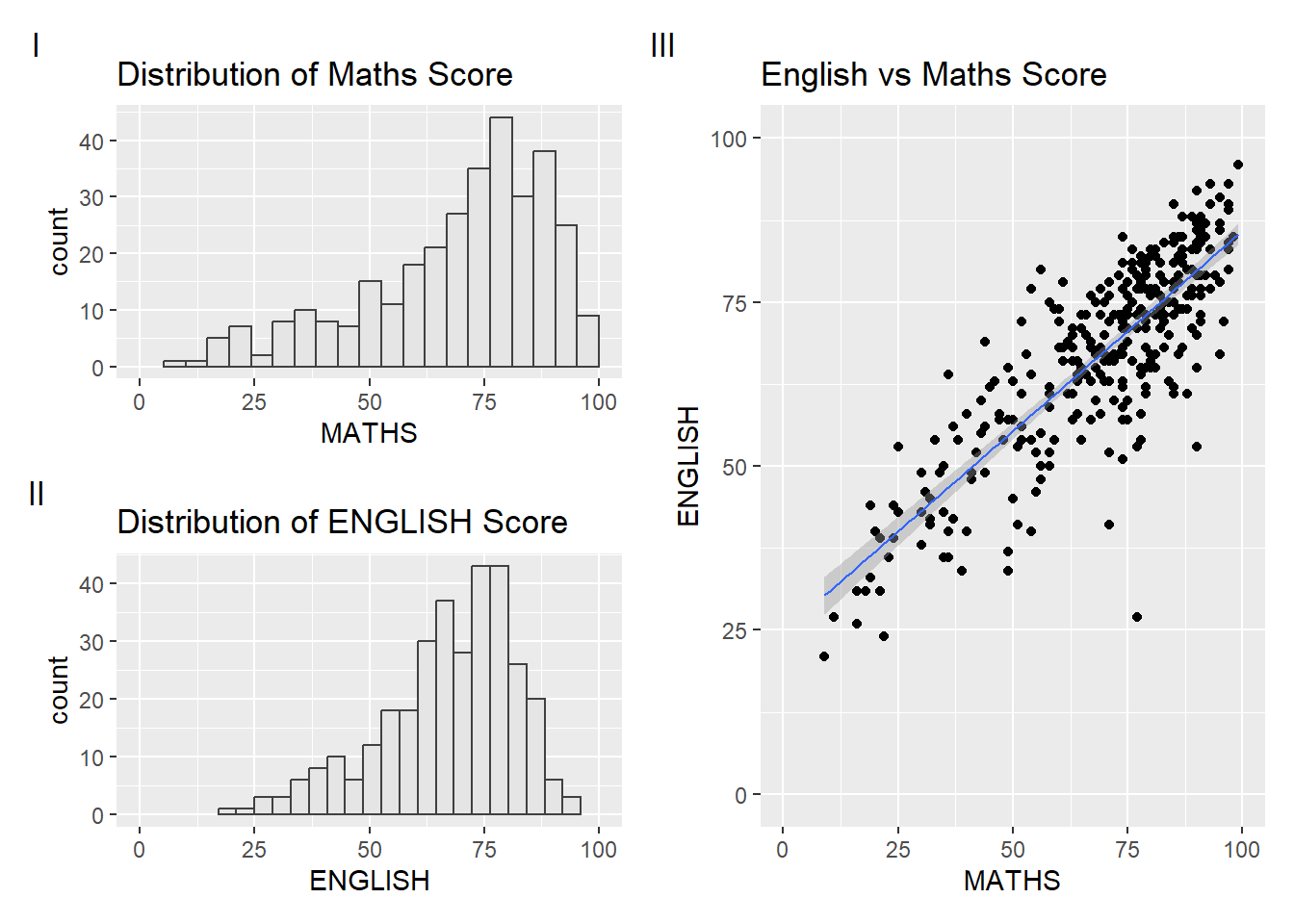
Creating figure with insert
p3 + inset_element(p2,
                   left = 0.02,
                   bottom = 0.7,
                   right = 0.5,
                   top = 1)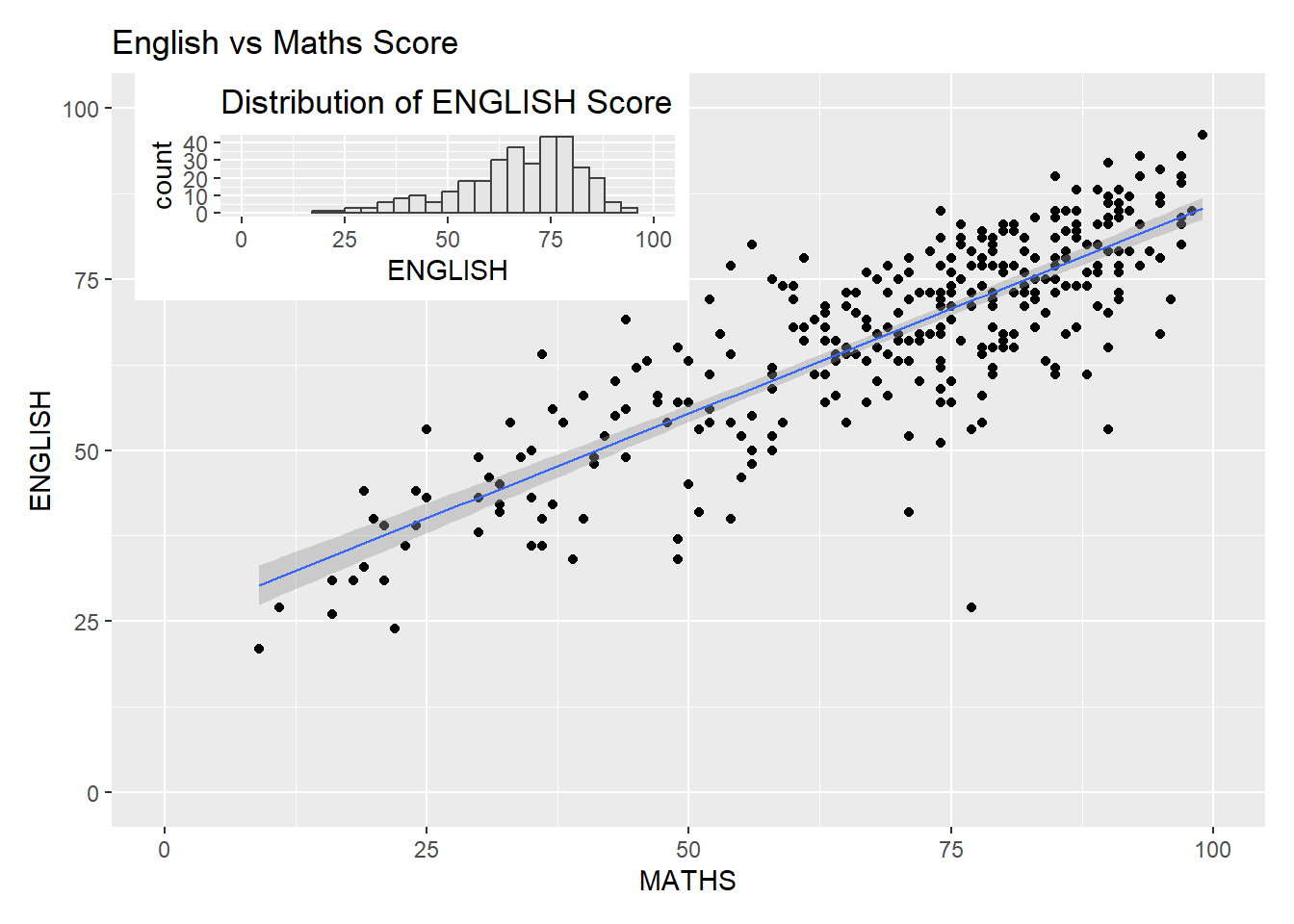
Creating a composite figure by using patchwork and ggtheme
patchwork <- (p1 / p2) | p3
patchwork & theme_economist()