Show the code
pacman::p_load(plotly, ggstatsplot, ggdist, ggthemes, tidyverse, tidyr,dplyr, ggridges,colorspace, rstantools, PMCMRplus, ggiraph, DT, hexbin, viridis, corrplot, data.table)The exercise aims to apply the concepts and methods of visual analytics to reveal demographic and financial characteristics of the city by using appropriate static and interactive statistical graphics methods. The visualizations were designed to be user-friendly and interactive, helping city managers and planners explore the complex data and reveal hidden patterns.
pacman::p_load(plotly, ggstatsplot, ggdist, ggthemes, tidyverse, tidyr,dplyr, ggridges,colorspace, rstantools, PMCMRplus, ggiraph, DT, hexbin, viridis, corrplot, data.table)FinancialJournal <- read_csv("data/FinancialJournal.csv", show_col_types = FALSE)
Participants <- read_csv("data/Participants.csv",show_col_types = FALSE)Two data sets are joined by matching Participant ID and stored in the new data table named “compiled”.
compiled <- merge(FinancialJournal, Participants, by = "participantId")Timestamp was converted into Month and Year format for further analysis and after that time stamp column was removed from the data table.
setDT(compiled)[, Month_Yr := format(as.Date(timestamp), "%Y-%m")]# Removing Timestamp column
compiled$timestamp <- NULLAfter that, transaction from “compiled” data table are grouped into each month per participant id and the resulting data table is named “compiled_monthly”.
compiled_monthly <- compiled %>%
  group_by(participantId,Month_Yr,category, householdSize, age, educationLevel,haveKids,interestGroup,joviality) %>%
summarize(total_amount = sum(amount), .groups="keep")For more thorough analysis, each category in category column is split into different column and stored in the data table called “data_cleaned”.
data_cleaned <- pivot_wider(compiled_monthly,
                       names_from = category,
                       values_from = total_amount)
Amount in negative values are converted into absolute values.
data_cleaned <- data_cleaned %>%
mutate_at(vars(Education, Food, Recreation, Shelter, Wage), abs)Since there are some blanks in education and rent adjustment columns, they are replaced with 0.
data_cleaned[is.na(data_cleaned)] <- 0Ridge plot is used to illustrate the distribution of wages across different education levels. It can be seen that distribution of lower wages are more dense in education level - “Low” and “High School and College” while distribution of higher wages are more dense in education level - “Graduate” and “Bachelors”.
ggplot(data_cleaned,
       aes(x = Wage,
           y = educationLevel,
           fill = after_stat(x))) +
  geom_density_ridges_gradient(
    scale = 3,
    rel_min_height = 0.01) +
  scale_fill_viridis_c(name = "Wages",
                       option = "H") +
  scale_x_continuous(
    name = "Wage",
    expand = c(0, 0)
  ) +
  scale_y_discrete(name = NULL, expand = expansion(add = c(0.2, 2.6)))+
  theme_ridges()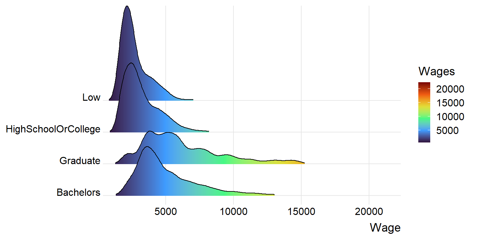
Next, to illustrate the confidence interval of distribution of mean wages, stat_gradientinterval() is used and tooltip showing mean score of each level is added to make the plot more interactive.
tooltip <- function(y, ymax, accuracy = .01) {
  mean <- scales::number(y, accuracy = accuracy)
  paste("Mean Wages:", mean)
}
gg_point <- data_cleaned %>%
  ggplot(aes(x = educationLevel,
             y = Wage)) +
  stat_gradientinterval(
    fill = "darkblue",
    show.legend = TRUE
  ) + stat_summary(aes(y = Wage,
                   tooltip = after_stat(
                     tooltip(y, ymax))),
    fun.data = "mean_se",
    geom = GeomInteractiveCol, fill = "darkblue", alpha = 0
  )+
  labs(
    title = "Confidence intervals of mean Wages")
girafe(ggobj = gg_point,
       width_svg = 8,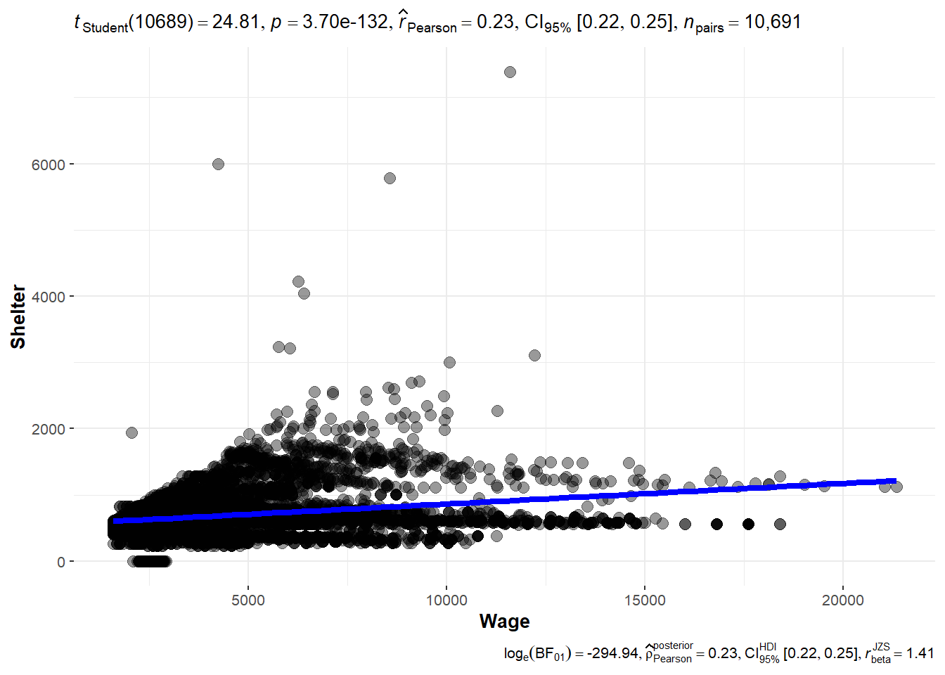
height_svg = 8*0.618)Next, to check if there is any correlation between Wage and amount spent on Shelter, ggscatterstats() function is used to build visualized significance test of correlation between Wage and Shelter. Although correlation is not very strong, it can be seen that the amount spent on shelter also increases as wage gets higher.
ggscatterstats(
  data = data_cleaned,
  x = Wage,
  y = Shelter,
  marginal = FALSE,
  )
In this section, animated bubble plot is built using plotly to visualize how wage and amount spent on shelter has changed throughout a year from March 2022 to Feb 2023. Hover is also used to show the interest group and participants who have kids or not are classified in different colors.
bubbleplot <- data_cleaned %>%
  plot_ly(x = ~Wage,
          y = ~Shelter,
          size = ~householdSize,
          color = ~haveKids,
          sizes = c(2, 100),
          frame = ~Month_Yr,
          text = ~interestGroup,
          hoverinfo = "text",
          type = 'scatter',
          mode = 'markers',
          alpha = 0.5
          ) %>%
  layout(showlegend = TRUE)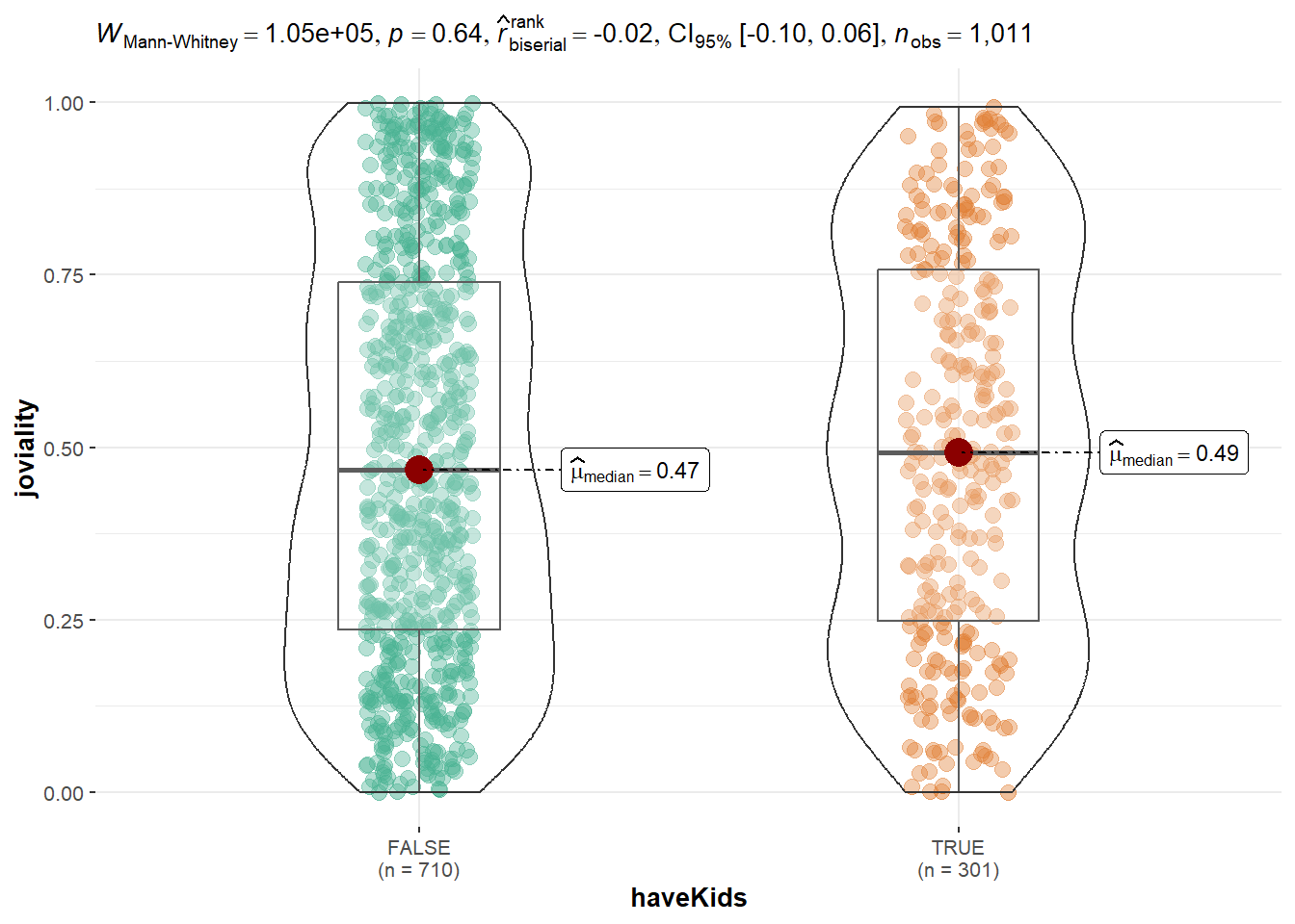
bubbleplotTo see joviality difference of participant who have kids and who don’t have kids, ggbetweenstats is used to illustrate two sample mean test of Joviality. Based on the graph below, it can be seen that joviality is not much difference between two groups.
ggbetweenstats(
  data = Participants,
  x = haveKids,
  y = joviality,
  type = "np",
  messages = FALSE
)
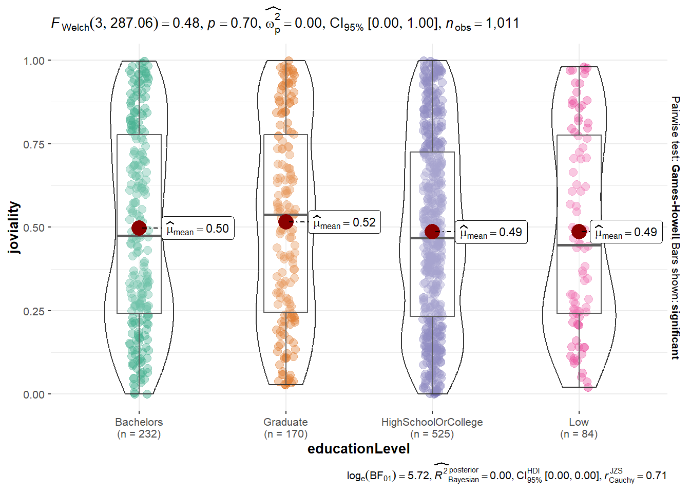
ggbetweenstats() is used again to visualize One-way anova test for joviality be education level.
ggbetweenstats(
  data = Participants,
  x = educationLevel,
  y = joviality,
  type = "p",
  mean.ci = TRUE,
  pairwise.comparisons = TRUE,
  pairwise.display = "s",
  p.adjust.method = "fdr",
  messages = FALSE
)
Average wage per participant are calculated and stored in data table named average_wage_ID.
average_wage_perID <- data_cleaned %>%
  group_by(participantId,joviality,age) %>%
  summarize(average_wage = mean(Wage), .groups = 'keep')
To show that joviality of participants with different wages are different, scatterplot with hexagon bin is used.
wage_joviality <- ggplot(data=average_wage_perID,
            aes(average_wage,
                joviality)) +
  scale_fill_gradient2(low = "#132B43",
  high = "#56B1F7",
  space = "Lab",
  na.value = "grey50",
  guide = "colourbar",
  aesthetics = "colour") +
  labs(x = "Average Wage", y = "Joviality", title = "Scatter Plot with Hexagons")
wage_joviality + geom_hex(bins=15)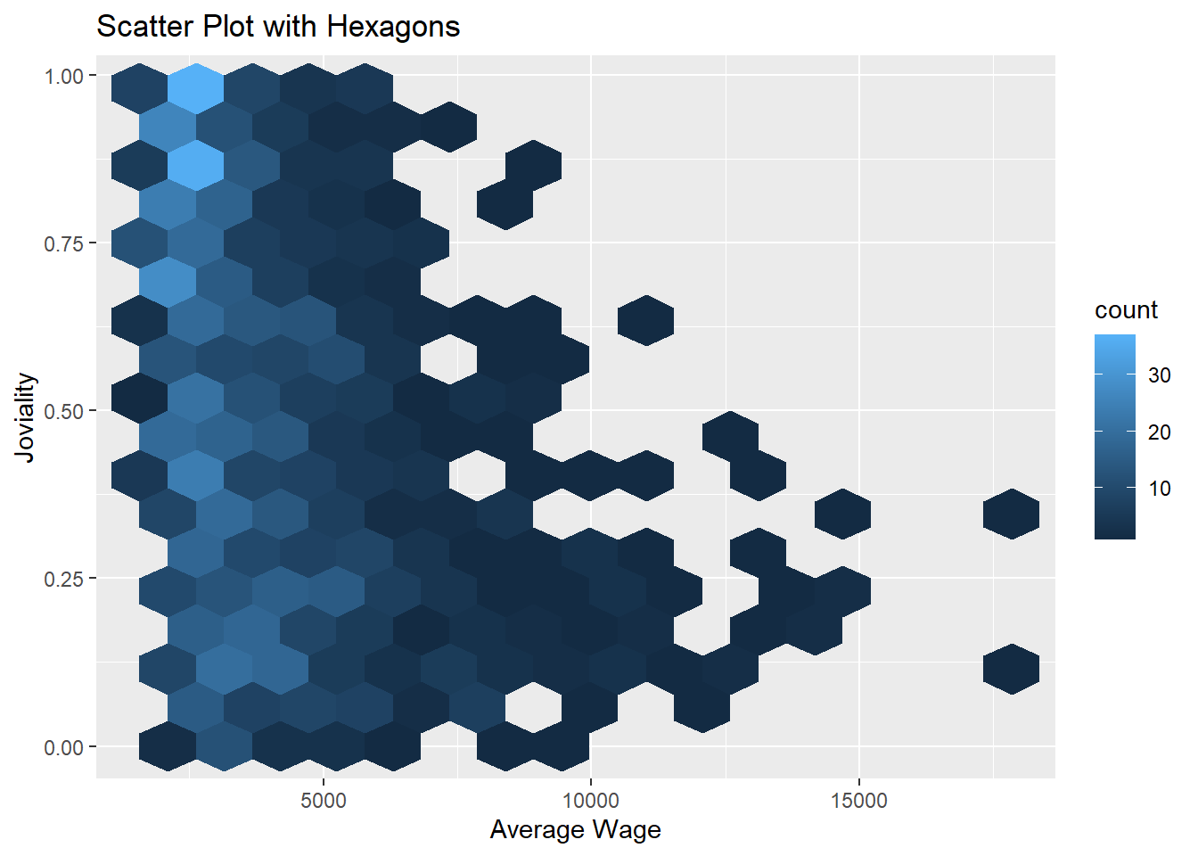
Ages are biined into 4 different bins and stored in new table called “age_binned”.
age_binned <- Participants %>%
  mutate(age_bins = cut(age,
               breaks = c(0,29,39,50))
)
Then, using ggbarstats(), interest groups according to different age groups are shown.
ggbarstats(age_binned,
           x = age_bins,
           y = interestGroup)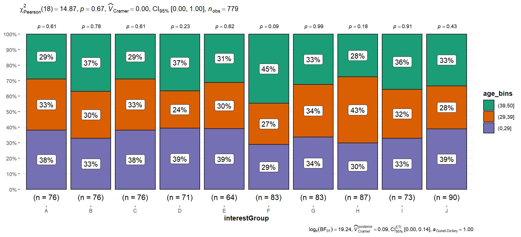
A new data table is created to store avearge amount spent on different categories by each household size.
categories_to_keep <- c('Shelter', 'Food', 'Recreation', 'Education')
amount_spent_byHHsize <- compiled_monthly %>%
  filter(category %in% categories_to_keep) %>%
  group_by(householdSize,category) %>%
  summarize(average_amount_spent = abs(mean(total_amount)), .groups = 'keep')
It can be seen that only participants with Household size with 3 spends on education.
amount_spent <- ggplot(amount_spent_byHHsize,
                aes(householdSize, average_amount_spent, fill = category)) +
  geom_bar(stat="identity") +

  labs(title = "Average Amount Spent by Household Size", x = "householdSize", y = "average_amount_spent", fill = "Category") +
  scale_fill_brewer(palette = "Set2")+
  theme_minimal()+
  theme(text = element_text(family = "Garamond"),
        plot.title = element_text(hjust = 0.4, size = 15, face = 'bold'),
        plot.margin = margin(20, 20, 20, 20),
        legend.position = "bottom",
        axis.text = element_text(size = 8, face = "bold"),
        axis.text.x = element_text(angle = 0, vjust = 0.5, hjust=1),
        axis.title.x = element_text(hjust = 0.5, size = 12, face = "bold"),
        axis.title.y = element_text(hjust = 0.5, size = 12, face = "bold"))

ggplotly(amount_spent)Before creating correlation plot, data table is formed into data frame.
df <- as.data.frame(data_cleaned)
df_expenses <- select(df,Education,Food,Recreation,Shelter,Wage)
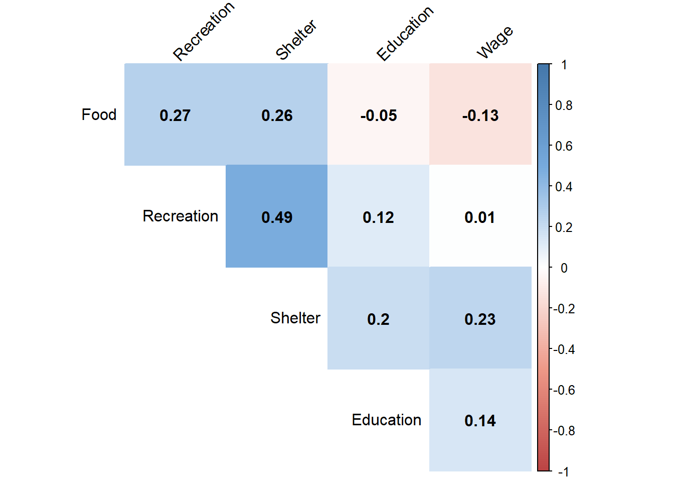
correlation <- cor(df_expenses)To test if there is any correlation between spending category including wage, correlation plot is created using corrplot().
col <- colorRampPalette(c("#BB4444", "#EE9988", "#FFFFFF", "#77AADD", "#4477AA"))
corrplot(correlation, method="color", col=col(200),
         type="upper", order="hclust",
         addCoef.col = "black", # Add coefficient of correlation
         tl.col="black", tl.srt=45, #Text label color and rotation
         # hide correlation coefficient on the principal diagonal
         diag=FALSE
         )